Journal
Nicolas Jenson; Anatomy Of A Typeface

"What loftiness of mind was that of man who thought of a way to communicate to whatever other person, though separated by the longest intervals of space and time, to speak with those yet unborn. All though various groupings of twenty simple letters on paper." Galileo 1564—1642
One Sunday morning I was in that dreamstate period, on the verge of awakening but still inhabiting the dreamworld. I dreamt that I was the point, the stroke, the actual beginning moment of a lower case 'a', not any old 'a' but Nicholas Jenson's first true Roman miniscule 'a'. It was perfect. I felt whole, complete, at one with all and everything. The point at the beginning of the alphabet. When nothing became something. Black ink to a moistened fibrous paper. The moment of conception, when past and future collided resulting in this abstract form which combined with 25 other forms manifest all thought, documenting reality to an unknown future. A simple 'a'. Form to a thought. Shape to a sound. Which transcends time and space. To have been that dot of black in infinite whiteness was an honour. I was as much the white space as the black of the form, a duality of two states simultaneously existing, entwining harmoniously... It was so comfortable that when I awoke I was sad. I mentioned it to my girlfriend who interpreted it as one too many typography books the night before. Then I forgot all about it until a few weeks later when Caroline from Grafik asked me to write an article called 'An Anatomy of a Typeface' its seemed only logical to write about the typeface I'd been in my dream. I began researching Nicholas Jenson, opening up a fascinating story about a man who changed the printed word forever.
1470. The Age of Discovery. Gutenburg's development of metal moveable type in Europe enabled the Conquest of Reality, reality could be propagated throughout the land, without pious establishments controlling knowledge. Knowledge became democratic, for the people. Jenson studied under Gutenburg for 3 years learning the art of this new technology, refining it into an artform. Gutenburg's invention was realised by Jensons first True Roman typeface. A convergence of all that had gone before. The alphabet now became in focus, sharpened through sacred geometry, asymmetric logic and the golden section. A monastic devotion of meditation brought forth a revelation. Jenson's inspired amalgamation of Roman capitals with the humanistic handwritten miniscule of the day imposed a structural unity upon the miniscule through remodelling the serif structures bringing form and clarity, unifying an essence of perfectly proportioned form.
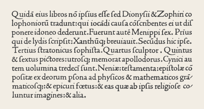
The Renaissance. Rebirth. The revival of Ancient Rome. Classical antiquity; mathematics, geometry, architecture, art and science infuse Jenson's typeface. Jenson sought a suitable vehicle to disseminate the knowledge of humanities new epoch. He created the typeface which became the foundation stone of all future typographical endeavours. Constructed with architectural precision he attained a unified cohesive whole. Practising the Renaissance ideal of balance between Form and Space, when white space is as important as the blackness of form. Presence v's Absence. This is illustrated in his 1470 edition of Eusebius, De Evangelics Praeparatione the counters, wordspacing, linespacing are suspended in perfect equilibrium with the letterform, whose relationship with the extender lengths add elegance to the balanced body of type. These decompressed forms are reaction to the dense blocks of Blackletter type of Gutenburgs printed matter. Instead spacious circular rhythmic forms grace the paper enticing the reader.
Stylised. Simple. Reductionist. Clear. Precise. Elegant. Considered. Harmonious. Balanced. Jenson Old Style Venetian typeface has sent ripples through the oceans of time; inspired numerous incarnations by the likes of William Morris, Bruce Rogers, Ronald Arnholm and Robert Slimbach and manifested words to numerous readers. A form which 536 years later in a incomprehensibly different world and reality to that which it was made is still used, loved, brings joy, intrigue and is a source of dreams...
"Do not hinder one's eyes, but rather help them and do them good. Moreover, the characters are so intelligently and carefully elaborated that the letters are neither smaller, larger nor thicker than reason or pleasure demand." Nicholas Jenson, 1482.
Published in Grafik, 146. November 2006.
Date
- 11.11.06
Category
