Page 1: Great Expectations

Description
We were very honoured to receive this from GraphicDesign&:
“This is an invitation to take part in the forthcoming GraphicDesign& project and publication: Page 1. GraphicDesign& are asking 70 graphic designers/typographers varying in age, background and experience, to each layout the text of page 1 of Great Expectations by Charles Dickens.
This is a typographic experiment of sorts. Free to lay out the text as you wish, it is an opportunity to explore, challenge or celebrate the conventions of book typography.”
and here is Paul's rationale for our response to the Page 1 brief:
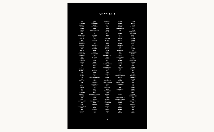
"When I first read the text I was drawn to the line "five little stone lozenges, each about a foot and a half long, which were arranged in a neat row beside their grave" which prompted me to arrange the text in five columns and conjured the vernacular of the cemetery. Centred type reinforced this, as the words seemed to reduce to names of the departed upon a monument to the dead. Removing all punctuation further abstracts the sentences, isolating the words as if engraved upon this monument. The typeface is Martin Majoor's robust and elegant Nexus Sans Bold Small Caps at 6pt a fitting face for those who have past away."
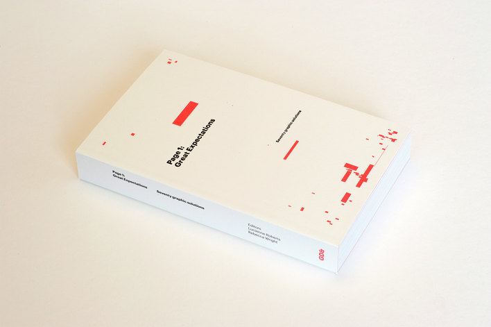
The book is beautifully designed by LucienneRoberts+ which is available to buy here, its well worth it and features the likes of: A Practice for Everyday Life, Phil Baines, Cartlidge Levene, Experimental Jetset, Fraser Muggeridge studio, Spin, Robin Kinross, Ellen Lupton, Morag Myerscough, Erik Spiekermann and many more!
Paul gave a pechca kucha of sorts presentation at the Design Museum for the book launch which you can read about here.
THE BOOK
